


A Tale of Two Logos (+ secrets revealed!)
Not a fan of art contests!

I’m not one for logo contests, too often they are ways for brands to further cheapen art and wriggle out of paying artists/designers for their work.
That said, I do find the exercise hones certain skills I don’t flex often. And in the case of a couple contests (one actually I’ve currently submitted to), where I believe in the cause looking for help, I don’t mind submitting my work.
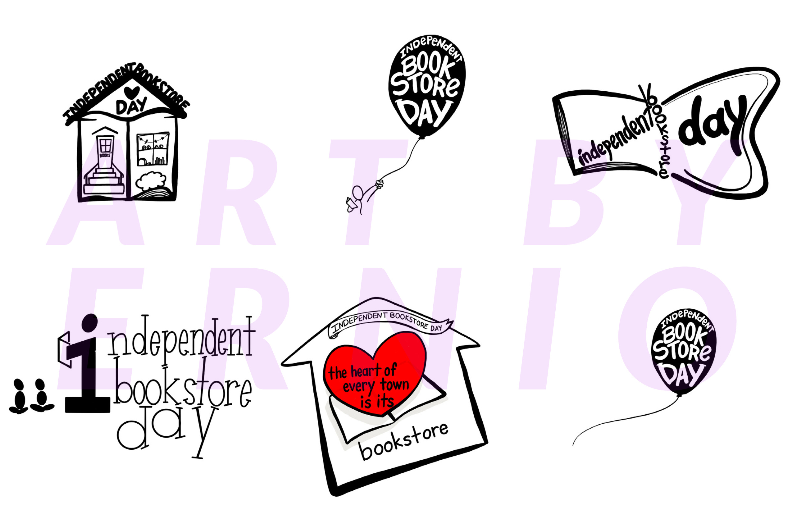
Last year, I submitted a number of options for Independent Bookstore Day partly because I liked the idea of my own exposure as an artist coinciding with getting my shop some ink as well. (I am a bookseller part-time and love working at my local indie shop.) I figured - worst case: I could use my logo on a shirt for the store or something.
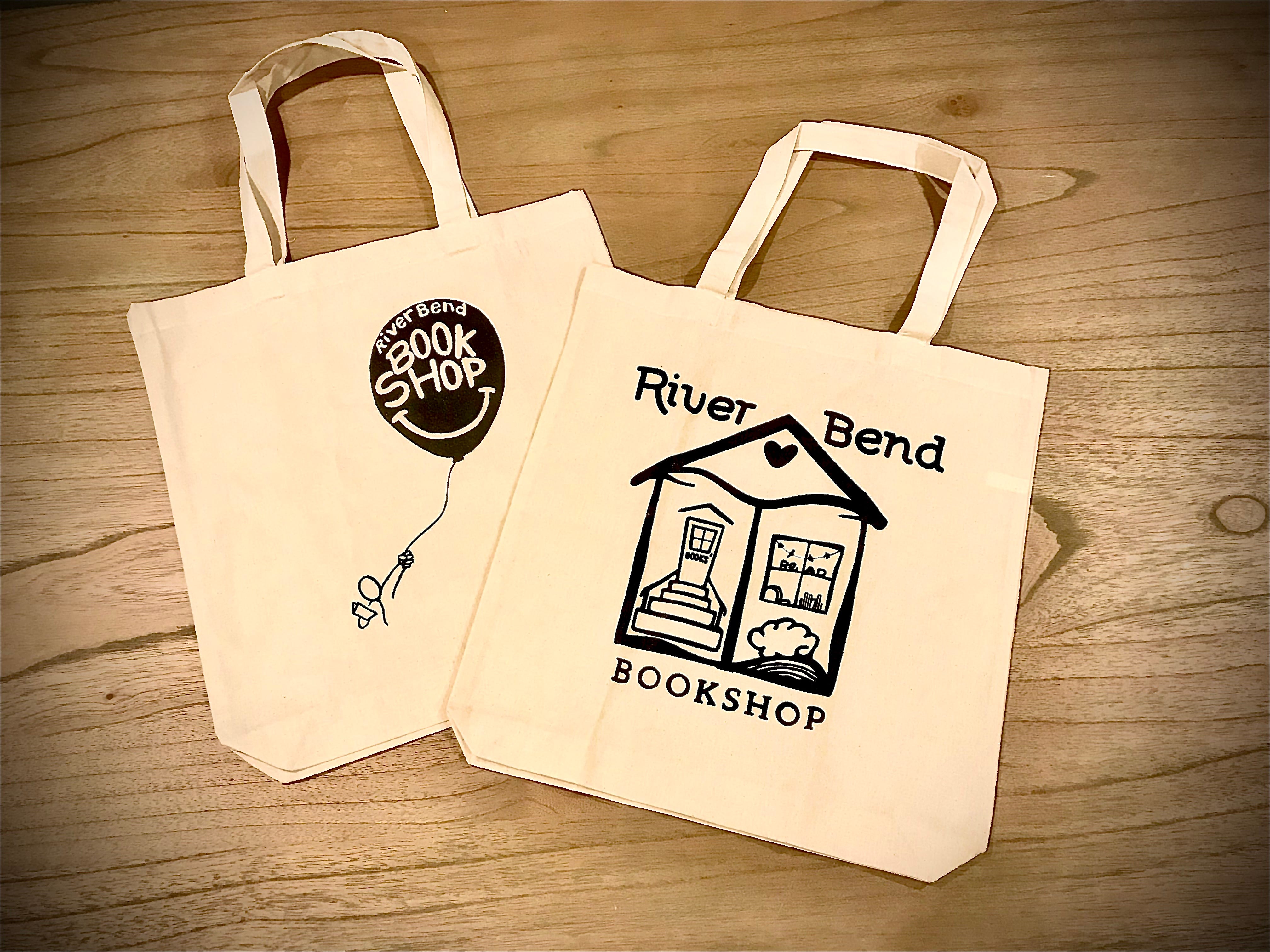
So after not winning the contest, I recently got the opportunity to revive and repurpose a couple of those designs for holiday totes we’re giving away at my bookshop.
One logo made complete sense to me: I had used our shop — which is rather small and homey — as inspiration for the logo. In the original drawing, the bookshop looks home-like, the door with the word BOOKS stickered across its middle. And our shop’s own logo wave is hidden in the eave of the roof/ top of the open book page. (Garland hangs in the window just like at ours.) I removed the IBD lettering and hand-drew our shop’s name to reflect our signature font.
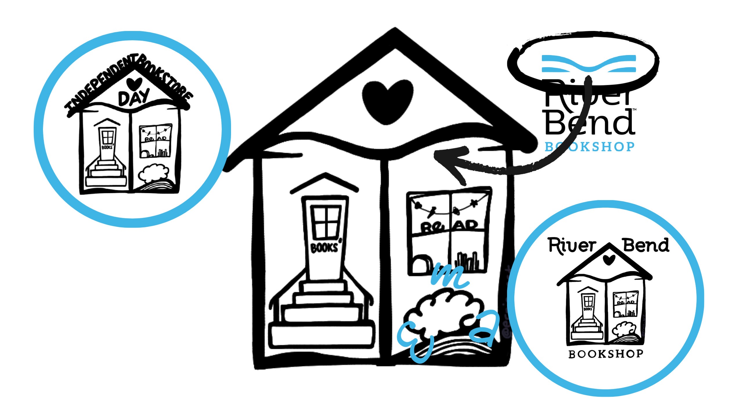
More secrets: Hidden in the bush under the window are the letters E for me, M for our owner’s name, and A for our store manager. At the time I drew that in (during COVID lockdown), we were the sole employees running the shop solo on alternating days. And we’ve been the steady, sturdy backbone of our small business since the start.
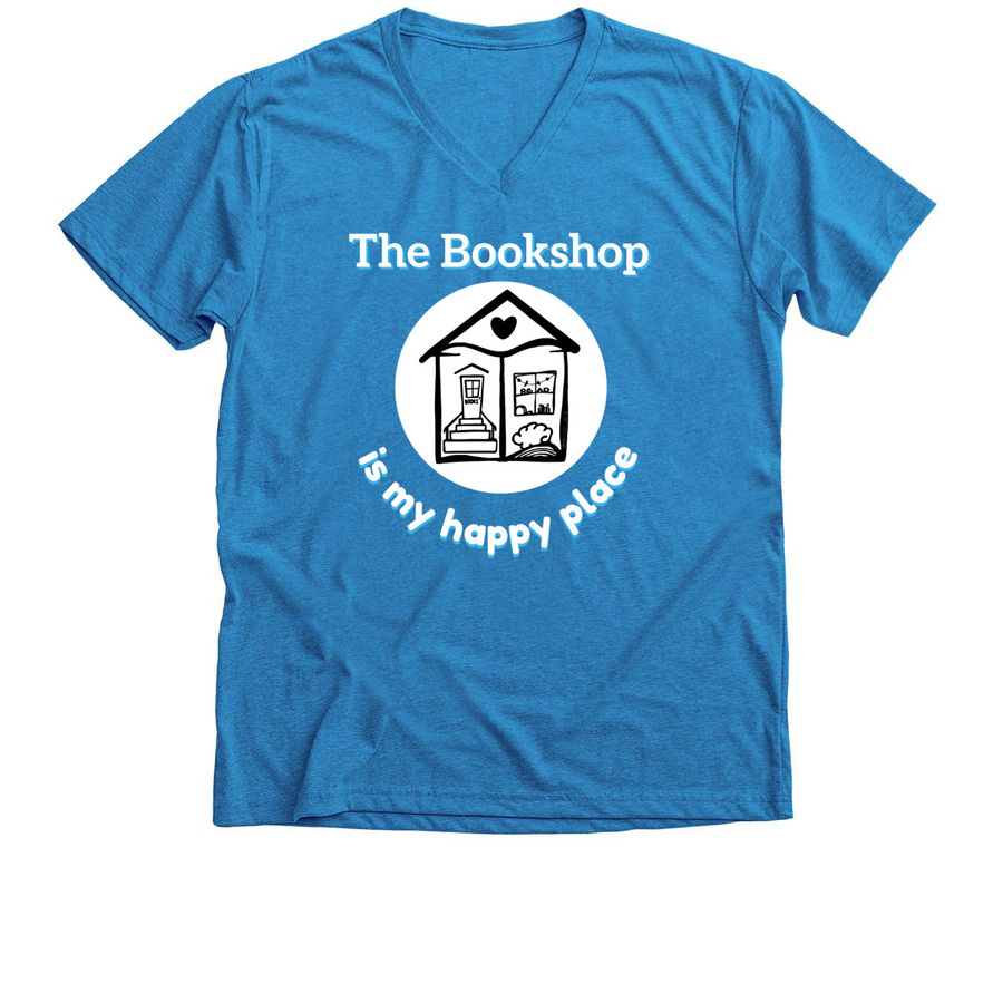
We previously made a t-shirt with the logo for our shop, using an extremely personal mantra (for me) that got me through the mayhem that was 2020: “the bookshop is my happy place.”
The other logo I reworked was my other favorite submission. In it, a “person” reading a book in one hand is holding/ being carried away by a balloon in the other.
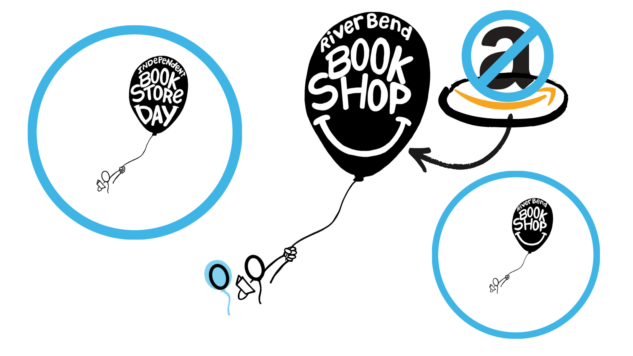
I honestly loved the childlike theme of it: imagination taking us away. The lettering came out so bubbly and fitting. Added in an actual smile vs. the suggested one on the D & Y letter-tops in the original (it’s also a subtle dig at a certain A-word soul-sucking corp #shopindie #shoplocal!) which… makes me happy. (See: the bookshop is my happy place.)
Big reveal! I never drew a body for the “person” for a few reasons: I loved the simplicity of just using the lines I needed to convey it, the perspective would’ve been a little odd with the balloon being in the viewer’s foreground, and the main reason is — if you haven’t caught my quotation “hints” — that it’s not a person at all. Holding the balloon, and the book, is actually another balloon. 🎈 (Take a closer look.) 😱
— Ernio
P.S. I’m thinking of doing my first mailing drop before the end of the year! So…if you haven’t subscribed, go ahead now, you get actual FUN stuff in the mail — among all those bills or official notices. ↓